Keybindings
Define, display, and persist keyboard shortcuts with @kit/keybindings.
What It Does
@kit/keybindings provides a typed action model, keyboard hooks, UI display components, and settings integration.
For cross-OS compatibility, cmd and ctrl are treated as equivalent in shortcut definitions.
When To Use
- You need configurable shortcuts in dashboard-like apps.
Prerequisites
keybindingsModelconfig exists.useKeybindingsFilters()initialized in app filters hook.
How To Use
Define model.
import { parseKeybindingsConfig } from '@kit/keybindings/config';
export const keybindingsModel = parseKeybindingsConfig({
'search.command': {
name: 'Search',
description: 'Open global search',
defaultShortcut: 'cmd+k',
context: 'global',
},
});Avoid OS-level shortcuts like cmd+q, cmd+w, or equivalents that conflict with browser/system behavior.
Register handlers.
'use client';
import { useKeybinding } from '@kit/keybindings/ui';
export function KeybindingsHandlers() {
useKeybinding('search.command', () => {
// trigger your command UI
});
return null;
}Display shortcuts.
Use KeybindingDisplay or settings UI integration (added by keybindings filters).
Typescript Support
@kit/keybindings can provide strong action-key inference and IDE autocomplete in consuming apps.
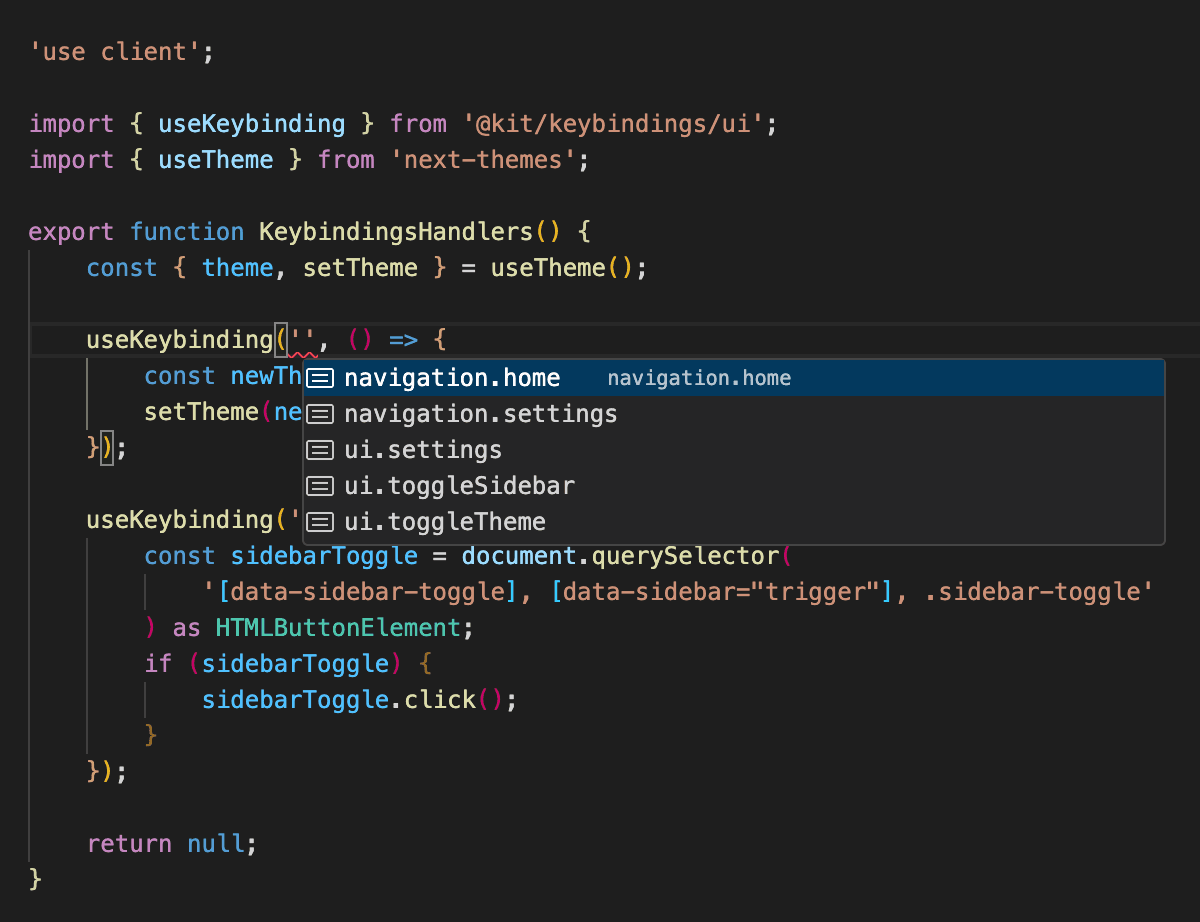
Keybindings typescript autocompletion
Recommended app-level declaration layout:
.d.ts typing logic
Keybinding action inference is enabled via module augmentation of @kit/keybindings/ui.
This binds useKeybinding, useShortcut, and KeybindingDisplay to your app keybindingsModel.
import '@kit/keybindings/ui'; import { KeybindingDisplay as KeybindingDisplayBase, useKeybinding as useKeybindingBase, useShortcut as useShortcutBase, } from '@kit/keybindings/ui/without-context'; import { keybindingsModel } from '../config/keybindings.config'; declare module '@kit/keybindings/ui' { export function useKeybinding<T extends typeof keybindingsModel = typeof keybindingsModel>( ...params: Parameters<typeof useKeybindingBase<T>> ): ReturnType<typeof useKeybindingBase<T>>; export function useShortcut<T extends typeof keybindingsModel = typeof keybindingsModel>( ...params: Parameters<typeof useShortcutBase<T>> ): ReturnType<typeof useShortcutBase<T>>; export function KeybindingDisplay<T extends typeof keybindingsModel = typeof keybindingsModel>( props: React.ComponentProps<typeof KeybindingDisplayBase<T>>, ): ReturnType<typeof KeybindingDisplayBase<T>>; }
The same pattern is used in:
apps/dashboard/@types/keybindings.d.tsapps/planoby-dashboard/@types/keybindings.d.tsexamples/pco-dashboard/@types/keybindings.d.ts
Tsconfig requirements
- Ensure the
.d.tsfile is included by your apptsconfig(viainclude,files, ortypeRoots). - Keep the import path to
keybindingsModelaligned with your app config location.
{
"compilerOptions": {
"typeRoots": ["./node_modules/@types", "./@types"]
}
}Filter API
Keybindings behavior is assembled from client, server, and cross-env filters to keep shortcut runtime, settings persistence, and translations modular.
| Filter | Parameters | Return | Registered By (package file) | Initialized In (app entrypoint) | Environment |
|---|---|---|---|---|---|
display_trpc_provider_child_in_dashboard | { clientTrpc?: TrpcClientWithQuery<Router<typeof appRouter>>; url?: (s: string) => string; keybindingsModel?: ReturnType<typeof parseKeybindingsConfig> } | React.ReactNode | kit/keybindings/src/filters/use-filters.tsx | apps/dashboard/hooks/use-filters.ts (useKeybindingsFilters) | client |
display_keybinding | { actionSlug: keyof KeybindingActions } | React.ReactNode | kit/keybindings/src/filters/use-filters-with-ctx.tsx | KeybindingsProvider context (injected by useKeybindingsFilters) | client |
get_shortcut | { actionSlug: keyof KeybindingActions } | { shortcut: string | null; formattedShortcut: string } | null | kit/keybindings/src/filters/use-filters-with-ctx.tsx | KeybindingsProvider context (injected by useKeybindingsFilters) | client |
get_settings_schema | {} | SettingsSchema | kit/keybindings/src/filters/use-filters.tsx | apps/dashboard/hooks/use-filters.ts (useKeybindingsFilters) | client |
get_settings_ui_config | { clientTrpc: TrpcClientWithQuery<Router<unknown>> } | ReturnType<typeof parseUISettingConfig> | kit/keybindings/src/filters/use-filters.tsx | apps/dashboard/hooks/use-filters.ts (useKeybindingsFilters) | client |
server_get_settings_schema | {} | SettingsSchema | kit/keybindings/src/filters/server-filters.ts | apps/dashboard/lib/init-server-filters.ts (initKeybindingsServerFilters) | server |
cross_env_get_translations | { language: string; namespace: string } | Record<string, string> | null | kit/keybindings/src/filters/cross-env-filters.ts | apps/dashboard/lib/init-cross-env-filters.ts (initKeybindingsFilters) | cross-env |
cross_env_get_namespaces | {} | string[] | kit/keybindings/src/filters/cross-env-filters.ts | apps/dashboard/lib/init-cross-env-filters.ts (initKeybindingsFilters) | cross-env |
- Keep
useKeybindingsFilters()inapps/dashboard/hooks/use-filters.ts. - Keep
initKeybindingsServerFilters()inapps/dashboard/lib/init-server-filters.ts. - Keep
initKeybindingsFilters()inapps/dashboard/lib/init-cross-env-filters.ts.
MCP Context
capability: keybindings_system entrypoints: - apps/dashboard/config/keybindings.config.ts - @kit/keybindings/ui - kit/keybindings/src/filters/use-filters.tsx - kit/keybindings/src/filters/use-filters-with-ctx.tsx - kit/keybindings/src/filters/server-filters.ts - kit/keybindings/src/filters/cross-env-filters.ts - apps/dashboard/hooks/use-filters.ts - apps/dashboard/lib/init-server-filters.ts - apps/dashboard/lib/init-cross-env-filters.ts inputs: - keybinding_action_map outputs: - active_keyboard_shortcuts constraints: - action IDs must exist in model - avoid collisions with browser/system shortcuts side_effects: - user shortcut updates may be persisted in settings storage
Agent Recipe
- Add action definitions in config.
- Register behavior with
useKeybinding. - Confirm settings page exposes shortcut editing UI.
Troubleshooting
- Handler not firing: check context (
globalvs input fields) and shortcut format. - Wrong URLs on navigation actions: verify route templates and slug transformers.
Related
API Reference
Components
KeybindingDisplay- Component to display shortcuts
KeybindingDisplayProps
| Prop | Type | Default |
|---|---|---|
actionSlug* | keyof T & string |
KeybindingsProvider- Context provider for keybindings
KeybindingsProviderProps
| Prop | Type | Default |
|---|---|---|
model* | T | |
storage | KeybindingsStorage | |
children* | React.ReactNode | |
navigationUrlTransformers | ((url: string) => string)[] |
KeybindingsTable- Settings table for editing keybindings
KeybindingsTableProps
| Prop | Type | Default |
|---|---|---|
filter | "global" | "contextual" |... | |
className | string | |
initialKeybindings | Record<string, string> | |
isLoading | boolean | false |
Why the settings architecture matters and how it removes duplicate logic.
How keybindings persistence works with settings-backed storage.
How is this guide?
Last updated on 3/27/2026