80% of the time, when you dress a form using react-hook-form and zod :
- We have to dress a zod schema
- Set the
react-hook-formhooks - Calling the same shadcn/ui Form components :
- FormField
- FormItem
- FormLabel
- FormControl
- FormMessage
- ...
- And we have to do it for each input we create, generating a lot of duplicated code
The QuickForm component is a solution to this redundancy. Set your zod schema and your object config. Then let the component handle the rest.
Installation
Make sure that the following shadcn/ui components are present in your project:
Copy and paste the following code into your project.
'use client';

import { Button } from '@kit/ui/button';
import { Form } from '@kit/ui/form';
import { toast } from '@kit/ui/sonner';
import { cn } from '@kit/utils';
import {
    ExtractQuickFormValues,
    QuickFormComponentProps,
    QuickFormSchemaMap,
Get the Kit
Kit required to see the full codeUpdate the import paths to match your project setup.
Features
- Avoid form redundancy
- Typescript auto-completion
- Zod validation
- Clean MVC architecture
- Equivalent component for server side rendering in the kit.
Usage
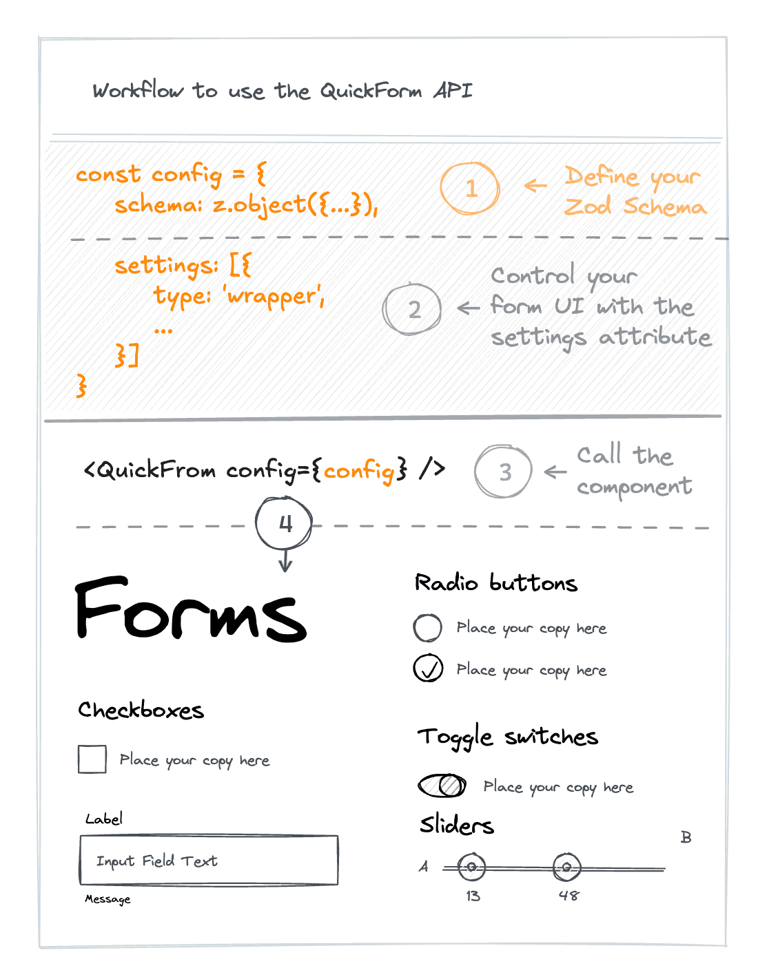

Quick Form workflow
import { type QuickFormConfig } from '@kit/utils/quick-form';
import { QuickForm } from '@kit/ui/quick-form';
import { z } from 'zod';<QuickForm config={{ id: 'my-from', schema: { name: z.string().min(2, 'Please enter at least 2 characters'), email: z.string().email('Please enter a valid email'), phone: z.string().optional().default(''), bio: z.string().max(200, 'Max 200 characters').default(''), }, settings: [ { type: 'wrapper', header: ( <div className="space-y-1"> <h3 className="text-lg font-semibold">Profile</h3> <p className="text-muted-foreground text-sm">Basic information</p> </div> ), settings: [ { type: 'text', slug: 'name', label: 'Name' }, { type: 'text', slug: 'email', label: 'Email' }, { type: 'phone', slug: 'phone', label: 'Phone' }, { type: 'textarea', slug: 'bio', label: 'Bio', description: 'Short bio (max 200 chars)', }, ], }, ], }} defaultValues={{ name: 'John Doe', email: 'john@example.com', phone: '', bio: '', }} onSubmit={(values) => { console.log('QuickForm submitted:', values); }} />
API Reference
Props
QuickFormComponentProps
| Prop | Type | Default |
|---|---|---|
config* | QuickFormConfig<T, I> | |
variant | "default" | "full-width" | |
defaultValues | Partial<ExtractQuickFormValues<T>... | |
onSubmit* | function | |
inputs | I | |
inputRenderer | React.ComponentType<{ [key: string]: any; type: string; field: any; slug: string; }> |
Config
QuickFormConfig
| Prop | Type | Default |
|---|---|---|
id* | string | |
title | string | |
description | string | |
className | string | |
header | React.ReactNode | |
submitButton | { text?: string;... | |
onSubmit | function | |
settings* | QuickFormUIConfig<T, I>[] | |
schema* | T | z.ZodObject<{ [x: string]: any; }, UnknownKeysParam, z.ZodTypeAny, { [x: string]: any; }, { [x: string]: any; }> |
QR Code
A compound component for generating QR codes with download functionality.
Ratio Preserver
A component that maintains aspect ratio and scales content to fit any viewport size while preserving proportions.
How is this guide?
Last updated on 1/29/2026