Installation
Install the following dependencies:
We use motion/react for the animations and react-remove-scroll is used by radix and shadcn/ui to prevent the scroll when the tour is open.
bash npm install motion/react react-remove-scroll Make sure that the following shadcn/ui components are present in your project:
Copy and paste the following code into your project.
'use client';
import { Button } from '@kit/ui/button';
import { Icon } from '@kit/ui/icon';
import { Popover, PopoverAnchor, PopoverArrow, PopoverContent, PopoverPortal, PopoverTrigger } from '@kit/ui/popover';
import { RemoveScroll } from '@kit/ui/remove-scroll';
import { cn } from '@kit/utils';
import { Slot } from '@radix-ui/react-slot';
import { AnimatePresence, motion } from 'motion/react';
import React, { createContext, useCallback, useContext, useEffect, useMemo, useRef, useState } from 'react';
const DEFAULT_MAX_SEARCH_TIMEOUT = 2000;
export interface TourElementClickOptions {
element: Element;
step: TourStep;
moveNext: () => Promise<void>;
}
export interface TourStep {
/**
* The element to highlight. You can use query selector, an element or a function that returns an element.
* If not defined not element will be highlighted.
*/
element?: string | Element | (() => Element);
/**
* The title of the step. Will be used as the popover title.
*/
title?: string;
/**
* The description of the step. Will be used as the popover description.
*/
description?: string | React.ReactNode;
/**
* When true, ignore the side and align properties and display the step as a dialog.
*
* @default false
*/
dialogDisplay?: boolean;
/**
* When `dialogDisplay` is true, define the position of the dialog.
*
* @default 'center'
*/
dialogPosition?:
| 'top-left'
| 'top'
| 'top-right'
| 'right'
| 'bottom-right'
| 'bottom'
| 'bottom-left'
| 'left'
| 'center'
| Partial<{
top: number;
left: number;
width: number;
height: number;
}>;
/**
* The side props of the PopoverContent component.
*/
side?: React.ComponentProps<typeof PopoverContent>['side'];
/**
* The align props of the PopoverContent component.
*/
align?: React.ComponentProps<typeof PopoverContent>['align'];
/**
* Allow to interact with the active element during the tour.
*
* @default false
*/
interactWithActiveElement?: boolean;
/**
* Callback triggered when the active element is clicked during the tour.
* Only works when interactWithActiveElement is true.
*
* @param event - The mouse event from the click
* @param options - Contains the element, the step and the moveNext callback
*/
onElementClick?: (event: MouseEvent, options: TourElementClickOptions) => Promise<void>;
/**
* When true, the next step will be handled in the onElementClick callback.
*
* @default false
*/
nextHandledInElementClick?: boolean;
/**
* When true, automatically move to the next step when the user clicks on the active element.
* Only works when interactWithActiveElement is true.
* When enabled, the Next button will be disabled to guide users to click the element.
*
* @default false
*/
nextOnClick?: boolean;
/**
* Control which tour elements should be hidden for this specific step.
* Accepts an array of element identifiers to hide.
*
* @example ['noClose', 'noPrevious'] // Hides close and previous buttons
* @default []
*/
display?: (
| 'noClose'
| 'noPrevious'
| 'noNext'
| 'noTitle'
| 'noDescription'
| 'noArrow'
| 'noProgress'
| 'noOverlay'
| 'noFrame'
)[];
/**
* Time in milliseconds to wait before attempting to find the element.
* Useful for elements that appear after animations or transitions.
*
* @default 0
*/
waitToGetElement?: number;
/**
* When true, suppresses the console error if the element is not found.
* Useful for optional tour steps or elements that may not always be present.
*
* @default false
*/
noErrorIfNotFound?: boolean;
onHighlightStarted?: (element?: Element, step?: TourStep) => void;
onHighlighted?: (element?: Element, step?: TourStep) => void;
}
export interface TourConfig {
steps: [TourStep, ...TourStep[]];
/**
* Not implemented yet.
* For now, the tour is always animated.
*
* @default true
*/
animate?: boolean;
/**
* Parameter of the window.scrollIntoView method.
*
* @default false
*/
smoothScroll?: boolean;
/**
* Allow to interact with the active element during the tour.
*
* @default false
*/
interactWithActiveElement?: boolean;
/**
* Allow to close the tour.
*
* @default true
*/
allowClose?: boolean;
/**
* Padding of the stage.
*
* @default 8
*/
stagePadding?: number;
/**
* Radius of the stage.
*
* @default 8
*/
stageRadius?: number;
/**
* Allow to use the keyboard to control the tour.
* You can use :
* - `space` and the `rightArrow` key to move to the next step.
* - `leftArrow` key to move to the previous step.
* - `escape` key to close the tour.
*
* @default true
*/
allowKeyboardControl?: boolean;
/**
* Maximum time in milliseconds to wait for an element to appear in the DOM.
* The tour will check for the element every 300ms until found or timeout is reached.
*
* @default 2000
*/
maxSearchTimeout?: number;
/**
* Callback when the highlight starts.
*
* @param element - The element that is being highlighted.
* @param step - The step that is being highlighted.
*/
onHighlightStarted?: (element?: Element, step?: TourStep) => void;
/**
* Callback when the highlight ends.
*
* @param element - The element that is being highlighted.
* @param step - The step that is being highlighted.
*/
onHighlighted?: (element?: Element, step?: TourStep) => void;
/**
* Callback when the tour starts.
*
* @param element - The element that is being highlighted.
* @param step - The step that is being highlighted.
*/
onDestroyStarted?: (element?: Element, step?: TourStep) => void;
/**
* Callback when the tour ends.
*
* @param element - The element that is being highlighted.
* @param step - The step that is being highlighted.
*/
onDestroyed?: (element?: Element, step?: TourStep) => void;
}
export interface StagePosition {
x: number;
y: number;
width: number;
height: number;
}
interface TourState {
activeIndex: number;
activeElement: Element | undefined;
activeStep: TourStep;
stagePosition: StagePosition | undefined;
}
interface TourContextType {
close: () => void;
config: TourConfig;
state: TourState;
moveNext: () => Promise<void>;
movePrevious: () => Promise<void>;
isFirstStep: () => boolean;
isLastStep: () => boolean;
refresh: () => Promise<void>;
}
const TourContext = createContext<TourContextType | null>(null);
function useTour() {
const context = useContext(TourContext);
if (!context) {
throw new Error('useTour must be used within a TourProvider');
}
return context;
}
const getElement = async (
elementSelector: string | Element | (() => Element),
maxSearchTimeout: number = DEFAULT_MAX_SEARCH_TIMEOUT,
): Promise<Element | undefined> => {
const getElementSync = (): Element | undefined => {
if (typeof elementSelector === 'string') {
return document.querySelector(elementSelector) || undefined;
} else if (typeof elementSelector === 'function') {
return elementSelector();
} else {
return elementSelector;
}
};
// Try to get element immediately
let element = getElementSync();
if (element) {
return element;
}
// If not found, retry every 300ms until maxSearchTimeout is reached
const startTime = Date.now();
const retryInterval = 300;
return new Promise<Element | undefined>((resolve) => {
const intervalId = setInterval(() => {
element = getElementSync();
if (element) {
clearInterval(intervalId);
resolve(element);
return;
}
// Check if timeout has been reached
if (Date.now() - startTime >= maxSearchTimeout) {
clearInterval(intervalId);
resolve(undefined);
}
}, retryInterval);
});
};
export interface TourProviderProps {
config: TourConfig;
open?: boolean;
defaultOpen?: boolean;
onOpenChange?: React.Dispatch<React.SetStateAction<boolean>>;
children: React.ReactNode;
}
function TourRoot({ children, defaultOpen, open, onOpenChange, config: initialConfig }: TourProviderProps) {
const [internalOpen, setInternalOpen] = useState(defaultOpen ?? false);
// Use controlled state if open prop is provided, otherwise use internal state
const isOpen = open !== undefined ? open : internalOpen;
const [state, setState] = useState<TourState | null>(null);
const setIsOpen = useCallback(
(value: boolean | ((prev: boolean) => boolean)) => {
const newValue = typeof value === 'function' ? value(isOpen) : value;
if (open === undefined) {
// Only update internal state if not controlled
setInternalOpen(newValue);
}
// if(!newValue) {
// setState(null);
// }
// Always call onOpenChange if provided
onOpenChange?.(newValue);
},
[isOpen, open, onOpenChange],
);
const config = useMemo<TourConfig>(
() => ({
animate: true, // TODO: make this configurable
allowClose: true,
smoothScroll: false,
stagePadding: 8,
stageRadius: 8,
allowKeyboardControl: true,
interactWithActiveElement: false,
maxSearchTimeout: DEFAULT_MAX_SEARCH_TIMEOUT,
...initialConfig,
}),
[initialConfig],
);
const popoverOpenChange = useCallback(
(value: boolean) => {
if ((config.interactWithActiveElement || state?.activeStep.interactWithActiveElement) && !value) return;
setIsOpen(value);
},
[setIsOpen, config.interactWithActiveElement, state?.activeStep.interactWithActiveElement],
);
const close = useCallback(() => {
setIsOpen(false);
}, [setIsOpen]);
const animationRef = useRef<number | undefined>(undefined);
const calculateStagePosition = useCallback(
(element: Element): StagePosition => {
const rect = element.getBoundingClientRect();
const padding = config.stagePadding || 10;
return {
x: rect.x - padding,
y: rect.y - padding,
width: rect.width + padding * 2,
height: rect.height + padding * 2,
};
},
[config.stagePadding],
);
const scrollToElement = useCallback(
(element: Element): Promise<void> => {
return new Promise((resolve) => {
// Create a promise that resolves when scrolling ends
const waitForScrollEnd = () => {
return new Promise<void>((scrollResolve) => {
const onScrollEnd = () => {
// Remove event listener to clean up
element.removeEventListener('scrollend', onScrollEnd);
scrollResolve();
};
// Check if scrollend event is supported
if ('scrollend' in element) {
element.addEventListener('scrollend', onScrollEnd, { once: true });
} else {
// Fallback for browsers that don't support scrollend event
let scrollTimeout: number;
let lastScrollTop = window.pageYOffset || document.documentElement.scrollTop;
let lastScrollLeft = window.pageXOffset || document.documentElement.scrollLeft;
const checkScrollEnd = () => {
const currentScrollTop = window.pageYOffset || document.documentElement.scrollTop;
const currentScrollLeft = window.pageXOffset || document.documentElement.scrollLeft;
if (currentScrollTop === lastScrollTop && currentScrollLeft === lastScrollLeft) {
clearTimeout(scrollTimeout);
scrollResolve();
return;
}
lastScrollTop = currentScrollTop;
lastScrollLeft = currentScrollLeft;
scrollTimeout = window.setTimeout(checkScrollEnd, 50);
};
// Start checking for scroll end
scrollTimeout = window.setTimeout(checkScrollEnd, 100);
// Fallback timeout in case scroll detection fails
setTimeout(() => {
clearTimeout(scrollTimeout);
scrollResolve();
}, 2000); // Max 2 second fallback
}
});
};
element.scrollIntoView({
behavior: config.smoothScroll ? 'smooth' : 'instant',
block: 'center',
inline: 'center',
});
waitForScrollEnd().then(resolve);
});
},
[config.smoothScroll],
);
const destroy = useCallback(() => {
if (animationRef.current) {
cancelAnimationFrame(animationRef.current);
}
if (
state &&
(config.interactWithActiveElement || state.activeStep.interactWithActiveElement) &&
state.activeElement
) {
state.activeElement.classList.remove('tour-element-highlight');
}
// Call onDestroyed hook
if (state && config.onDestroyed && state.activeElement && state.activeStep) {
config.onDestroyed(state.activeElement, state.activeStep);
}
setState(null);
}, [config.onDestroyed, state, config.interactWithActiveElement]);
const calculateState = useCallback(
async (stepIndex: number = 0): Promise<TourState | false> => {
const steps = config.steps;
if (!steps || !steps[stepIndex]) {
close();
return false;
}
const step = steps[stepIndex];
// Wait before attempting to find element if waitToGetElement is specified
if (step.waitToGetElement && step.waitToGetElement > 0) {
await new Promise((resolve) => setTimeout(resolve, step.waitToGetElement));
}
const element = step.element
? await getElement(step.element, config.maxSearchTimeout || DEFAULT_MAX_SEARCH_TIMEOUT)
: undefined;
if (!element && step.element) {
if (!step.noErrorIfNotFound) {
console.error('Element not found for tour step:', step.element);
}
return false;
}
// Add classes to new active element and scroll only if not center positioned
if (element) {
if (config.interactWithActiveElement || step.interactWithActiveElement) {
document.querySelectorAll('.tour-element-highlight').forEach((el) => {
el.classList.remove('tour-element-highlight');
});
element.classList.add('tour-element-highlight');
}
// Wait for scroll to complete before continuing
await scrollToElement(element);
}
// Calculate stage position - only if element exists and not center positioned
const stagePosition = element ? calculateStagePosition(element) : undefined;
return {
activeIndex: stepIndex,
activeElement: element,
activeStep: step,
stagePosition,
};
},
[
config.steps,
config.interactWithActiveElement,
config.maxSearchTimeout,
scrollToElement,
calculateStagePosition,
close,
],
);
const drive = useCallback(
async (stepIndex: number = 0) => {
const newState = await calculateState(stepIndex);
if (!newState) return;
// Update state
setState((prev) => ({
...prev,
...newState,
}));
// Call hooks
if (newState.activeStep.onHighlightStarted) {
newState.activeStep.onHighlightStarted(newState.activeElement, newState.activeStep);
} else if (config.onHighlightStarted) {
config.onHighlightStarted(newState.activeElement, newState.activeStep);
}
if (newState.activeStep.onHighlighted) {
newState.activeStep.onHighlighted(newState.activeElement, newState.activeStep);
} else if (config.onHighlighted) {
config.onHighlighted(newState.activeElement, newState.activeStep);
}
},
[config, calculateState],
);
const moveNext = useCallback(async () => {
if (!state) return;
const steps = config.steps || [];
const currentIndex = state.activeIndex;
const nextIndex = currentIndex + 1;
if (steps[nextIndex]) {
await drive(nextIndex);
} else {
close();
}
}, [config.steps, state, drive, close]);
const movePrevious = useCallback(async () => {
if (!state) return;
const steps = config.steps || [];
const currentIndex = state.activeIndex;
const prevIndex = currentIndex - 1;
if (steps[prevIndex]) {
await drive(prevIndex);
}
}, [config.steps, state, drive]);
// Re-add highlight class on interaction with active element
useEffect(() => {
if (
state &&
(config.interactWithActiveElement || state.activeStep.interactWithActiveElement) &&
state.activeElement
) {
const element = state.activeElement;
const step = state.activeStep;
const timeoutIds: ReturnType<typeof setTimeout>[] = [];
const handleInteraction = () => {
const timeoutId = setTimeout(() => {
// element.classList.add('tour-element-highlight');
document.querySelectorAll('.tour-element-highlight').forEach((el) => {
el.classList.remove('tour-element-highlight');
});
element.classList.add('tour-element-highlight');
}, 1);
timeoutIds.push(timeoutId);
};
const handleClick = async (event: MouseEvent) => {
// Re-add highlight class
handleInteraction();
// Call onElementClick callback if provided
if (step.onElementClick) {
await step.onElementClick(event, { element, step, moveNext });
}
// Move to next step if nextOnClick is enabled
if (step.nextOnClick) {
await moveNext();
}
};
// Add event listeners for mouseup and mousedown
element.addEventListener('mouseup', handleInteraction);
element.addEventListener('mousedown', handleInteraction);
// Add click event listener with additional logic
element.addEventListener('click', handleClick as unknown as EventListener);
// Cleanup function to remove event listeners and clear timeouts
return () => {
element.removeEventListener('click', handleClick as unknown as EventListener);
element.removeEventListener('mouseup', handleInteraction);
element.removeEventListener('mousedown', handleInteraction);
timeoutIds.forEach((id) => clearTimeout(id));
};
}
}, [state, config.interactWithActiveElement, moveNext]);
useEffect(() => {
if (!config.allowKeyboardControl) return;
const handleKeyDown = async (event: KeyboardEvent) => {
if (config.allowClose && event.key === 'Escape') {
close();
}
switch (event.key) {
case 'ArrowRight':
case ' ': {
event.preventDefault();
const step = state?.activeStep;
const isInteractive = config.interactWithActiveElement || step?.interactWithActiveElement;
if (isInteractive && (step?.nextOnClick || step?.nextHandledInElementClick)) {
return;
}
await moveNext();
break;
}
case 'ArrowLeft':
event.preventDefault();
await movePrevious();
break;
}
};
document.addEventListener('keydown', handleKeyDown);
return () => document.removeEventListener('keydown', handleKeyDown);
}, [
config.allowKeyboardControl,
config.allowClose,
close,
moveNext,
movePrevious,
state?.activeStep,
config.interactWithActiveElement,
]);
useEffect(() => {
if (!state || !state.activeElement) return;
// cannot be debounced because it needs to be called on every resize for the radix popover to work
const handleResize = () => {
if (state.activeElement) {
const newStagePosition = calculateStagePosition(state.activeElement);
setState((prev) => {
if (!prev) return null;
return {
...prev,
stagePosition: newStagePosition,
};
});
}
};
window.addEventListener('resize', handleResize);
return () => {
window.removeEventListener('resize', handleResize);
};
}, [state, calculateStagePosition]);
// Cleanup & setup on unmount/mount
const driveRef = useRef(drive);
const destroyRef = useRef(destroy);
useEffect(() => {
driveRef.current(0);
return () => {
destroyRef.current();
};
}, []);
const contextValue = useMemo<TourContextType | null>(
() =>
!state
? null
: {
close,
config,
state,
moveNext,
movePrevious,
isFirstStep: () => state.activeIndex === 0,
isLastStep: () => {
const steps = config.steps || [];
return state.activeIndex === steps.length - 1;
},
refresh: async () => {
await drive(state.activeIndex);
},
},
[config, state, moveNext, movePrevious, close],
);
return (
<Popover open={isOpen} onOpenChange={popoverOpenChange}>
{/* // <Popover open={isOpen} onOpenChange={popoverChangeSetter}> */}
{isOpen
? // <TourProvider
// close={close}
// // popoverOpenChange={popoverOpenChange}
// // setPopoverChangeSetter={setPopoverChangeSetter}
// config={{
// interactWithActiveElement,
// ...config,
// }}
// {...props}
// >
// {children}
// </TourProvider>
state &&
contextValue && (
<TourContext.Provider value={contextValue}>
{(config.interactWithActiveElement || state.activeStep.interactWithActiveElement) && (
<style id="tour-driver-style">
{`
* {
pointer-events: none !important;
}
[data-slot="tour-content"], [data-slot="tour-content"] *, .tour-element-highlight, .tour-element-highlight * {
pointer-events: auto !important;
}
`}
</style>
)}
<div id="salut-tout-le-monde"></div>
{children}
{state.stagePosition && (
<PopoverAnchor asChild>
<div
id="tour-anchor"
aria-hidden="true"
className="pointer-events-none fixed"
style={{
left: `${state.stagePosition.x}px`,
top: `${state.stagePosition.y}px`,
width: `${state.stagePosition.width}px`,
height: `${state.stagePosition.height}px`,
zIndex: 998,
}}
/>
</PopoverAnchor>
)}
</TourContext.Provider>
)
: children}
</Popover>
);
}
const TourTrigger = PopoverTrigger;
const TourPortal: React.FC<React.ComponentProps<typeof PopoverPortal>> = ({ children, ...props }) => {
return <PopoverPortal {...props}>
<>
{children}
</>
</PopoverPortal>;
};
interface TourFrameProps extends Omit<React.ComponentProps<typeof motion.div>, 'id' | 'children'> {}
function TourFrame(props: TourFrameProps) {
const { state, config } = useTour();
const p = config.stagePadding || 0;
// Hide if display includes 'noFrame'
if (state.activeStep.display?.includes('noFrame')) {
return null;
}
return (
<AnimatePresence>
{state.stagePosition && (
<motion.div
id="tour-frame"
className="outline-primary pointer-events-none fixed rounded-md outline-2"
initial={{
opacity: 0,
left: `${state.stagePosition.x - p}px`,
top: `${state.stagePosition.y - p}px`,
width: `${state.stagePosition.width + p * 2}px`,
height: `${state.stagePosition.height + p * 2}px`,
zIndex: 1001,
}}
animate={{
opacity: 1,
left: `${state.stagePosition.x - p}px`,
top: `${state.stagePosition.y - p}px`,
width: `${state.stagePosition.width + p * 2}px`,
height: `${state.stagePosition.height + p * 2}px`,
zIndex: 1001,
}}
exit={{
opacity: 0,
left: `${state.stagePosition.x - p}px`,
top: `${state.stagePosition.y - p}px`,
width: `${state.stagePosition.width + p * 2}px`,
height: `${state.stagePosition.height + p * 2}px`,
zIndex: 1001,
}}
{...props}
style={{
...props.style,
borderRadius: config.stageRadius || 5,
}}
/>
)}
</AnimatePresence>
);
}
export interface TourOverlayProps {
/**
* The behavior of the overlay when the user clicks on it.
*
* @default 'close'
*/
clickBehavior?: 'close' | 'nextStep';
}
function TourOverlay({
className,
clickBehavior = 'close',
style,
...props
}: TourOverlayProps & Omit<React.HTMLAttributes<HTMLDivElement>, 'color' | 'opacity' | 'onClick'>) {
const { state, config, close, moveNext } = useTour();
const handleOverlayClick = useCallback(
(event: React.MouseEvent) => {
const target = event.target as Element;
if (state.activeElement?.contains(target) || target === state.activeElement) {
return;
}
if (
clickBehavior === 'close' &&
config.allowClose &&
!(state.activeStep.interactWithActiveElement || config.interactWithActiveElement)
) {
close();
} else if (clickBehavior === 'nextStep') {
moveNext();
}
},
[
state.activeElement,
clickBehavior,
config.allowClose,
close,
moveNext,
state.activeStep.interactWithActiveElement,
config.interactWithActiveElement,
],
);
const generateStageSvgPathString = useCallback(
(stage: StagePosition | undefined) => {
const windowX = window.innerWidth;
const windowY = window.innerHeight;
if (!stage) {
return `M${windowX},0L0,0L0,${windowY}L${windowX},${windowY}L${windowX},0Z`;
}
const stagePadding = config.stagePadding || 0;
const stageRadius = config.stageRadius || 5;
const stageWidth = stage.width + stagePadding * 2;
const stageHeight = stage.height + stagePadding * 2;
// prevent glitches when stage is too small for radius
const limitedRadius = Math.min(stageRadius, stageWidth / 2, stageHeight / 2);
// no value below 0 allowed + round down
const normalizedRadius = Math.floor(Math.max(limitedRadius, 0));
const highlightBoxX = stage.x - stagePadding + normalizedRadius;
const highlightBoxY = stage.y - stagePadding;
const highlightBoxWidth = stageWidth - normalizedRadius * 2;
const highlightBoxHeight = stageHeight - normalizedRadius * 2;
return `M${windowX},0L0,0L0,${windowY}L${windowX},${windowY}L${windowX},0Z
M${highlightBoxX},${highlightBoxY} h${highlightBoxWidth} a${normalizedRadius},${normalizedRadius} 0 0 1 ${normalizedRadius},${normalizedRadius} v${highlightBoxHeight} a${normalizedRadius},${normalizedRadius} 0 0 1 -${normalizedRadius},${normalizedRadius} h-${highlightBoxWidth} a${normalizedRadius},${normalizedRadius} 0 0 1 -${normalizedRadius},-${normalizedRadius} v-${highlightBoxHeight} a${normalizedRadius},${normalizedRadius} 0 0 1 ${normalizedRadius},-${normalizedRadius} z`;
},
[config.stagePadding, config.stageRadius],
);
// Track window size for mask bounds
const [windowSize, setWindowSize] = useState<{ w: number; h: number }>({ w: 0, h: 0 });
useEffect(() => {
const update = () => setWindowSize({ w: window.innerWidth, h: window.innerHeight });
update();
window.addEventListener('resize', update);
return () => window.removeEventListener('resize', update);
}, []);
// todo: instead of removing it in safari, fix the overlay mask to make it work in safari
// Detect Safari browser
const [isSafari, setIsSafari] = useState(false);
useEffect(() => {
const userAgent = navigator.userAgent.toLowerCase();
const isSafariBrowser =
userAgent.indexOf('safari') !== -1 &&
userAgent.indexOf('chrome') === -1 &&
userAgent.indexOf('chromium') === -1;
setIsSafari(isSafariBrowser);
}, []);
if (isSafari) {
return null;
}
// Hide if display includes 'noOverlay'
if (state.activeStep.display?.includes('noOverlay')) {
return null;
}
return (
<>
{/* Inline SVG mask definition: white keeps overlay, black cuts a hole (no blur) */}
<svg width={0} height={0} style={{ position: 'absolute' }} aria-hidden="true">
<mask
id={'tour-overlay-mask'}
maskUnits="userSpaceOnUse"
x={0}
y={0}
width={windowSize.w}
height={windowSize.h}
>
<motion.path
fill="white"
fillRule="evenodd"
initial={{ d: generateStageSvgPathString(state.stagePosition) }}
animate={{ d: generateStageSvgPathString(state.stagePosition) }}
/>
</mask>
</svg>
<div
onClick={handleOverlayClick}
className={cn(
'fixed inset-0 top-0 left-0 h-screen w-screen bg-black/50 mask-[url(#tour-overlay-mask)]',
className,
)}
style={{
zIndex: 1000,
...style,
}}
{...props}
/>
</>
);
}
// Calculate dialog position styles
const getDialogPositionStyles = (dialogPosition: TourStep['dialogPosition']): React.CSSProperties => {
if (!dialogPosition) return {};
if (typeof dialogPosition === 'object' && 'top' in dialogPosition) {
// Custom position object
return {
position: 'fixed' as const,
top: dialogPosition.top,
left: dialogPosition.left,
width: dialogPosition.width,
height: dialogPosition.height,
};
}
// Predefined positions
switch (dialogPosition) {
case 'top-left':
return {
position: 'fixed' as const,
top: '1rem',
left: '1rem',
};
case 'top':
return {
position: 'fixed' as const,
top: '1rem',
left: '50%',
transform: 'translateX(-50%)',
};
case 'top-right':
return {
position: 'fixed' as const,
top: '1rem',
right: '1rem',
};
case 'right':
return {
position: 'fixed' as const,
top: '50%',
right: '1rem',
transform: 'translateY(-50%)',
};
case 'bottom-right':
return {
position: 'fixed' as const,
bottom: '1rem',
right: '1rem',
};
case 'bottom':
return {
position: 'fixed' as const,
bottom: '1rem',
left: '50%',
transform: 'translateX(-50%)',
};
case 'bottom-left':
return {
position: 'fixed' as const,
bottom: '1rem',
left: '1rem',
};
case 'left':
return {
position: 'fixed' as const,
top: '50%',
left: '1rem',
transform: 'translateY(-50%)',
};
default:
return {
position: 'fixed' as const,
top: '50%',
left: '50%',
transform: 'translate(-50%, -50%)',
};
}
};
interface TourContentProps extends Omit<React.ComponentProps<typeof PopoverContent>, 'side' | 'align'> {}
function TourContent({
className: propClassName,
children,
sideOffset = 0,
collisionPadding = 10,
closeIcon = true,
...props
}: TourContentProps) {
const { state, config } = useTour();
const step = state.activeStep;
const className = cn(
'bg-background text-popover-foreground max-w-sm rounded-lg border p-4 shadow-lg outline-hidden',
propClassName,
);
return (
<RemoveScroll>
{step.dialogDisplay && (
<div
className="animate-in fade-in-0"
data-slot="tour-content"
style={{
zIndex: 1001,
}}
>
<div
className={cn(className)}
style={{
zIndex: 1001,
...getDialogPositionStyles(step.dialogPosition),
...props.style,
}}
{...props}
>
{children as React.ReactNode}
{closeIcon && (
<TourClose asChild>
<button
aria-label="Close"
className="ring-offset-background focus:ring-ring absolute top-4 right-4 rounded-xs opacity-70 transition-opacity hover:opacity-100 focus:ring-2 focus:ring-offset-2 focus:outline-hidden disabled:pointer-events-none"
>
<Icon name="X" className="h-4 w-4" />
<span className="sr-only">Close</span>
</button>
</TourClose>
)}
</div>
</div>
)}
<PopoverContent
data-slot="tour-content"
className={cn(
className,
'animate-in fade-in-0 zoom-in-95',
step.dialogDisplay && 'pointer-events-none hidden',
)}
closeIcon={false}
side={step.side}
align={step.align}
sideOffset={(config.stagePadding || 0) + sideOffset}
collisionPadding={collisionPadding}
style={{
zIndex: 1000,
...props.style,
}}
{...props}
{...(step.dialogDisplay ? { onInteractOutside: (e) => e.preventDefault() } : {})}
>
{children as React.ReactNode}
{closeIcon && (
<TourClose asChild>
<button
aria-label="Close"
className="ring-offset-background focus:ring-ring absolute top-4 right-4 rounded-xs opacity-70 transition-opacity hover:opacity-100 focus:ring-2 focus:ring-offset-2 focus:outline-hidden disabled:pointer-events-none"
>
<Icon name="X" className="h-4 w-4" />
<span className="sr-only">Close</span>
</button>
</TourClose>
)}
</PopoverContent>
</RemoveScroll>
);
}
function TourTitle({ className, children, ...props }: React.HTMLAttributes<HTMLHeadingElement>) {
const { state } = useTour();
const title = children || state.activeStep?.title;
// Hide if display includes 'noTitle'
if (state.activeStep.display?.includes('noTitle')) {
return null;
}
return !title ? null : (
<h3 className={cn('mb-2 text-lg font-semibold', className)} {...props}>
{title}
</h3>
);
}
function TourDescription({ className, children, ...props }: React.HTMLAttributes<HTMLParagraphElement>) {
const { state } = useTour();
const description = children || state.activeStep?.description;
// Hide if display includes 'noDescription'
if (state.activeStep.display?.includes('noDescription')) {
return null;
}
return !description ? null : (
<p className={cn('text-muted-foreground mb-4 text-sm', className)} {...props}>
{description}
</p>
);
}
export interface TourProgressProps {
/**
* The children of the progress component. Takes either a string schema or a function that returns a React node.
*
* @default '{{current}} / {{total}}'
*/
progressChildren?: string | ((current: number, total: number) => React.ReactNode);
}
function TourProgress({
className,
progressChildren = '{{current}} / {{total}}',
...props
}: TourProgressProps & Omit<React.HTMLAttributes<HTMLDivElement>, 'children'>) {
const { state, config } = useTour();
// Hide if display includes 'noProgress'
if (state.activeStep.display?.includes('noProgress')) {
return null;
}
const steps = config.steps || [];
const current = state.activeIndex + 1;
const total = steps.length;
const children =
typeof progressChildren === 'function'
? progressChildren(current, total)
: progressChildren.replace('{{current}}', current.toString()).replace('{{total}}', total.toString());
return (
<div className={cn('text-muted-foreground/80 mb-3 text-xs', className)} {...props}>
{children}
</div>
);
}
const TourArrow = ({ className, ...props }: React.ComponentProps<typeof PopoverArrow>) => {
const { state } = useTour();
// Hide if display includes 'noArrow'
if (state.activeStep.display?.includes('noArrow')) {
return null;
}
return state.activeStep?.dialogDisplay || !state.activeElement ? null : (
<PopoverArrow {...props} className={cn('bg-background!', className)} />
);
};
export interface TourCloseProps {
asChild?: boolean;
}
const TourClose = React.forwardRef<
HTMLButtonElement,
TourCloseProps & Omit<React.ComponentPropsWithoutRef<typeof Button>, 'aria-label' | 'onClick'>
>(({ children, size = 'sm', variant = 'ghost', asChild, ...props }, ref) => {
const { close, state } = useTour();
const Comp = asChild ? Slot : Button;
// Hide if display includes 'noClose'
if (state.activeStep.display?.includes('noClose')) {
return null;
}
return (
<Comp ref={ref} variant={variant} size={size} onClick={close} aria-label="Skip" {...props}>
{children || 'Skip'}
</Comp>
);
});
TourClose.displayName = 'TourClose';
export interface TourPreviousProps {
asChild?: boolean;
onClick?: (element?: Element, step?: TourStep) => void;
}
const TourPrevious = React.forwardRef<
HTMLButtonElement,
TourPreviousProps & Omit<React.ComponentPropsWithoutRef<typeof Button>, 'aria-label' | 'onClick' | 'asChild'>
>(({ className, children, variant, size, disabled, onClick, ...props }, ref) => {
const { state, config, movePrevious, isFirstStep } = useTour();
const handlePrevClick = useCallback(async () => {
if (!state.activeStep) throw new Error('No active step');
const step = state.activeStep;
onClick?.(state.activeElement, step);
await movePrevious();
}, [state.activeStep, state.activeElement, config, movePrevious, onClick]);
// Hide if display includes 'noPrevious'
if (state.activeStep.display?.includes('noPrevious')) {
return null;
}
return (
<Button
ref={ref}
aria-label="Previous"
onClick={handlePrevClick}
disabled={isFirstStep() || !config.allowClose || disabled}
className={cn(className)}
variant={variant ?? 'outline'}
size={size ?? 'sm'}
{...props}
>
{children || '← Previous'}
</Button>
);
});
TourPrevious.displayName = 'TourPrevious';
export interface TourNextProps {
asChild?: boolean;
/**
* The children of the next button when the last step is reached.
*/
lastChildren?: React.ReactNode;
/**
* The callback function to be called when the next button is clicked.
*
* @param element - The element that is being highlighted.
* @param step - The step that is being highlighted.
*/
onClick?: (element?: Element, step?: TourStep) => void;
}
const TourNext = React.forwardRef<
HTMLButtonElement,
TourNextProps & Omit<React.ComponentPropsWithoutRef<typeof Button>, 'aria-label' | 'onClick' | 'asChild'>
>(({ className, children, variant, size, disabled, lastChildren, onClick, ...props }, ref) => {
const { state, config, moveNext, isLastStep, close } = useTour();
const handleNextClick = useCallback(async () => {
if (!state.activeStep) throw new Error('No active step');
const step = state.activeStep;
onClick?.(state.activeElement, step);
if (isLastStep()) {
close();
} else {
await moveNext();
}
}, [state.activeStep, state.activeElement, config, isLastStep, close, moveNext, onClick]);
// Disable Next button when nextOnClick is enabled and interactWithActiveElement is true
const shouldDisable = useMemo(() => {
const step = state.activeStep;
const isInteractive = config.interactWithActiveElement || step?.interactWithActiveElement;
return (
!config.allowClose || disabled || (isInteractive && (step?.nextOnClick || step?.nextHandledInElementClick))
);
}, [config.allowClose, config.interactWithActiveElement, disabled, state.activeStep]);
// Hide if display includes 'noNext'
if (state.activeStep.display?.includes('noNext')) {
return null;
}
return (
<Button
ref={ref}
aria-label="Next"
onClick={handleNextClick}
disabled={shouldDisable}
className={cn(className)}
variant={variant ?? 'default'}
size={size ?? 'sm'}
{...props}
>
{isLastStep() ? lastChildren || 'Done' : children || 'Next →'}
</Button>
);
});
TourNext.displayName = 'TourNext';
/* ___________________________ HIGHER LEVEL COMPONENTS ___________________________ */
// Default Tour component that combines all parts
function TourBase({ className, children, ...props }: React.HTMLAttributes<HTMLDivElement>) {
return (
<TourPortal>
<TourOverlay />
<TourFrame />
<TourContent className={className} {...props}>
<TourArrow />
<TourProgress />
<TourTitle />
<TourDescription />
{children as React.ReactNode}
<div className="flex w-full flex-row-reverse justify-between gap-2">
<div className="flex flex-row-reverse gap-2">
<TourNext />
<TourPrevious />
</div>
<TourClose />
</div>
</TourContent>
</TourPortal>
);
}
export {
TourRoot as Tour,
TourArrow,
TourBase,
TourClose,
TourContent,
TourDescription,
TourFrame,
TourNext,
TourOverlay,
TourPortal,
TourPrevious,
TourProgress,
TourTitle,
TourTrigger,
useTour,
};
Update the import paths to match your project setup.
Usage
import { Tour, TourArrow, TourClose, TourContent, TourDescription, TourFrame, TourNext, TourOverlay, TourPortal, TourPrevious, TourProgress, TourTitle, TourTrigger, type TourStep, } from '@kit/ui/tour';
<TourRoot config={{ steps: [{ element: '#app', title: 'App', description: 'App' }] }}> <TourTrigger /> <TourPortal> <TourOverlay /> <TourFrame /> <TourContent> <TourArrow /> <TourProgress /> <TourTitle /> <TourDescription /> <div className="flex w-full flex-row-reverse justify-between gap-2"> <div className="flex flex-row-reverse gap-2"> <TourNext /> <TourPrevious /> </div> <TourClose /> </div> </TourContent> </TourPortal> </TourRoot>
Features
- Built on top of the shadcn/ui components, using the radix design system
- Support for different step types such as "dialog" and "floating"
- Support for customizable content per step
- Flexible positioning of the tour dialog per step
- Progress tracking shows users their progress through the tour
Keyboard controls
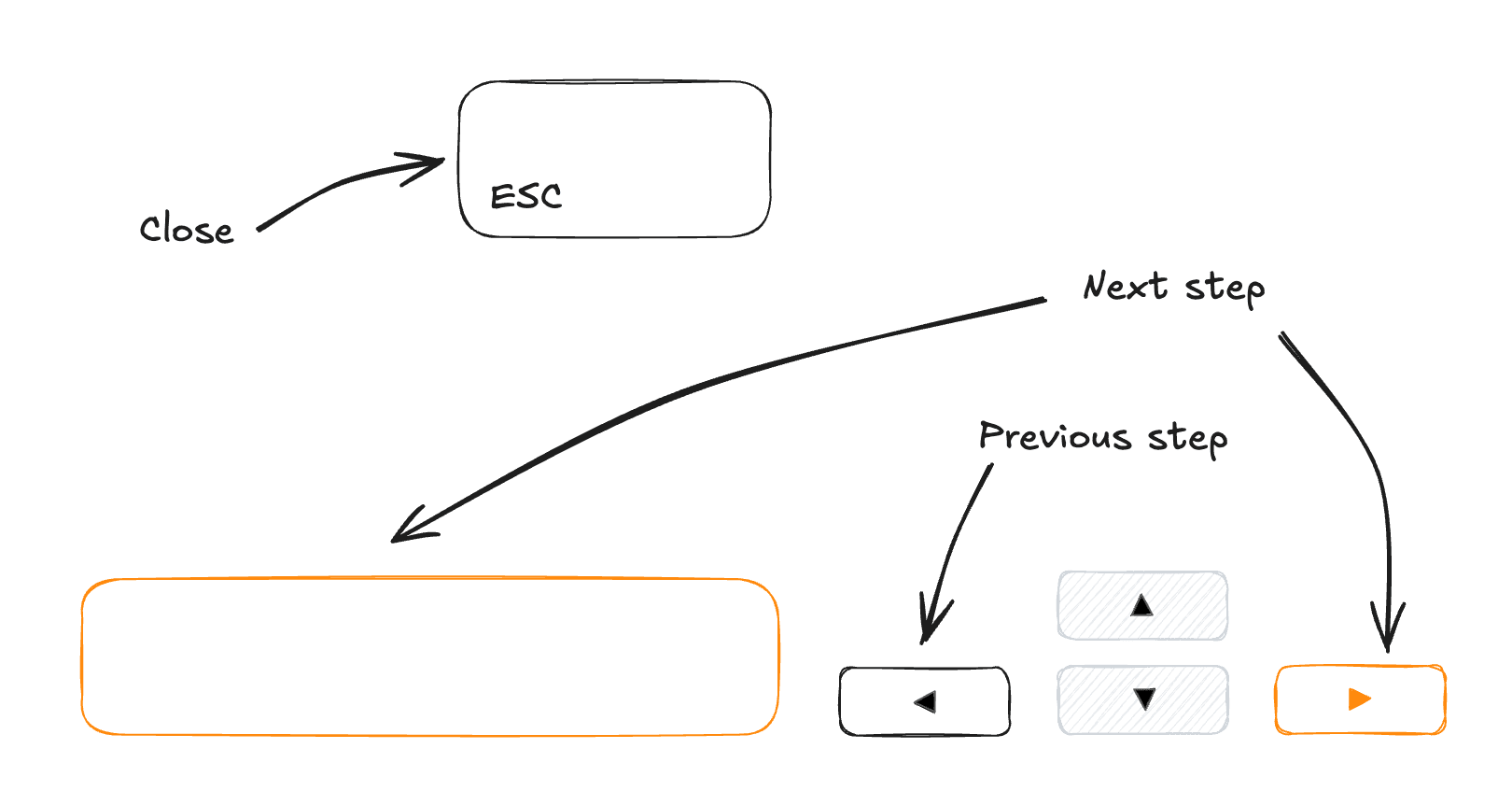

Tour component keyboard controls
| Key | Action |
|---|---|
ArrowRight Space | Next step |
ArrowLeft | Previous step |
Escape | Close tour |
API Reference
Root
Contains all the parts of the tour.
| Prop | Type | Default |
|---|---|---|
config* | TourConfig | |
open | boolean | |
defaultOpen | boolean | |
onOpenChange | React.Dispatch<React.SetStateAction<boolean>... | |
children* | React.ReactNode | |
Trigger
An extended version of the PopoverTrigger component.
Portal
An extended version of the PopoverPortal component.
Frame
The frame that wrap the highlighted element. Optional according your styling preferences.
Takes React.ComponentProps<'div'> or React.ComponentProps<typeof motion.div> props.
Overlay
The overlay that cover the entire screen except the highlighted element.
| Prop | Type | Default |
|---|---|---|
clickBehavior | "close" | "nextStep" | 'close' |
Content
Takes the same props as the PopoverContent component.
Calls the RemoveScroll component to prevent the scroll when the tour is open.
When the dialogDisplay is true, it display another div different than the PopoverContent component to display the dialog.
We are calling the preventDefault method on the onInteractOutside prop to prevent the tour from being closed when the user clicks on the dialog.
Title
To display the title of the active step.
Props : React.HTMLAttributes<HTMLHeadingElement>.
Description
To display the description of the active step.
Props : React.HTMLAttributes<HTMLParagraphElement>.
Progress
A progress component to show which step the user is on.
| Prop | Type | Default |
|---|---|---|
progressChildren | string | ((current: number, total: number)... | '{{current}} / {{total}}' |
Arrow
An extended version of the PopoverArrow component.
Close
A button to close/skip the tour.
TourCloseProps
| Prop | Type | Default |
|---|---|---|
asChild | boolean |
Previous
TourPreviousProps
| Prop | Type | Default |
|---|---|---|
asChild | boolean | |
onClick | function |
Next
TourNextProps
| Prop | Type | Default |
|---|---|---|
asChild | boolean | |
lastChildren | React.ReactNode | |
onClick | function |
A stepper component to display step by step content.
An animated dialog component powered by motion.
How is this guide?
Last updated on 1/29/2026