Features
- Seamless transition between trigger and content
- Radix component architecture
- Handle open state logic internally
- Remove scrollbar when the dialog is open
Netflix card

Images
A dialog component providing a user experience close to a native app animation. It gives the illusion that the element is always present in the viewport during the transition to a fixed position.
We are using the motion layout layoutId props to create seamless "magic motion" effects between two separate elements
Installation
Install the following dependencies:
We use motion/react and framer-motion for animations, as well as react-remove-scroll to prevent the scroll when the dialog is open.
Make sure that the following radix portal is present in your project
Copy and paste the following code into your project.
'use client';

import { useEffect, useRef, useState } from 'react';

export function useFnDelay<T>(
    asyncFactory: (delay: (timeMs: number) => Promise<void>) => Promise<T>,
    deps: React.DependencyList,
) {
    const [value, setValue] = useState<T | null>(null);
    const abortControllerRef = useRef<AbortController | null>(null);

    useEffect(() => {
        // Abort previous async operation
        if (abortControllerRef.current) {
            abortControllerRef.current.abort();
        }

        // Create new abort controller for this operation
        abortControllerRef.current = new AbortController();
        const currentAbortController = abortControllerRef.current;

        // Create the delay function that returns a promise
        const delayFn = (timeMs: number): Promise<void> => {
            return new Promise((resolve, reject) => {
                const timeoutId = setTimeout(() => {
                    if (!currentAbortController.signal.aborted) {
                        resolve();
                    }
                }, timeMs);

                // Handle abortion
                currentAbortController.signal.addEventListener('abort', () => {
                    clearTimeout(timeoutId);
                    reject(new Error('Delay aborted'));
                });
            });
        };

        // Execute the async factory function
        const executeFactory = async () => {
            try {
                const result = await asyncFactory(delayFn);

                // Only update if not aborted
                if (!currentAbortController.signal.aborted) {
                    setValue(result);
                }
            } catch (error) {
                // Ignore abortion errors, but log others
                if (error instanceof Error && error.message !== 'Delay aborted') {
                    console.error('Error in useFnDelay factory:', error);
                }
            }
        };

        executeFactory();

        // Cleanup function
        return () => {
            if (currentAbortController) {
                currentAbortController.abort();
            }
        };
    }, deps);

    // Cleanup on unmount
    useEffect(() => {
        return () => {
            if (abortControllerRef.current) {
                abortControllerRef.current.abort();
            }
        };
    }, []);

    return value;
}

// Simpler hook built on top of useFnDelay
export function useDelay<T>(value: T, delayMs: number) {
    return useFnDelay(
        async (delay: (timeMs: number) => Promise<void>) => {
            if (delayMs > 0) {
                await delay(delayMs);
            }
            return value;
        },
        [value, delayMs],
    );
}
'use client';

import { Icon } from '@kit/ui/icon';
import { Portal } from '@kit/ui/portal';
import { cn } from '@kit/utils';
import { AnimatePresence, type Easing, HTMLMotionProps, motion, type Transition } from 'framer-motion';
import React, { useCallback, useId, useMemo, useState } from 'react';
import { RemoveScroll } from 'react-remove-scroll';
import { useDelay, useFnDelay } from '../hooks/use-delay';

const Z_INDEX = 1000;

const DEFAULT_DURATION = 0.5;
const DEFAULT_EASE = [0.7, 0, 0.6, 0.917] as Easing;

const DEFAULT_TRANSITION: Transition & { duration: number; layout: { duration: number } } = {
    ease: DEFAULT_EASE,
    duration: DEFAULT_DURATION,
    layout: {
        ease: DEFAULT_EASE,
        duration: DEFAULT_DURATION,
    },
};

const createDurationVariables = (duration: number) => {
    return {
        ['--dialog-duration' as string]: `${duration}s`,
        ['--dialog-duration-95' as string]: `${duration * 0.95}s`,
        ['--dialog-duration-90' as string]: `${duration * 0.9}s`,
        ['--dialog-duration-80' as string]: `${duration * 0.8}s`,
        ['--dialog-duration-70' as string]: `${duration * 0.7}s`,
        ['--dialog-duration-60' as string]: `${duration * 0.6}s`,
        ['--dialog-duration-50' as string]: `${duration * 0.5}s`,
        ['--dialog-duration-40' as string]: `${duration * 0.4}s`,
        ['--dialog-duration-30' as string]: `${duration * 0.3}s`,
        ['--dialog-duration-20' as string]: `${duration * 0.2}s`,
        ['--dialog-duration-10' as string]: `${duration * 0.1}s`,
    };
};

// can be replaced by lodash.merge
function deepMerge<T>(obj1: T, obj2: T = {} as T): T {
    const result = { ...obj1 };

    for (const key in obj2) {
        if (obj2[key] && typeof obj2[key] === 'object' && !Array.isArray(obj2[key])) {
            result[key] = deepMerge(
                (result[key] as T[Extract<keyof T, string>]) || ({} as T[Extract<keyof T, string>]),
                obj2[key] as T[Extract<keyof T, string>],
            );
        } else {
            result[key] = obj2[key];
        }
    }

    return result;
}

interface DialogContextType {
    id: string;
    /**
     * Used to set the `data-open` attribute on the dialog components.
     *
     * For a human, `dataOpen` change almost at the same time as `presenceOpen`.
     *
     * `dataOpen` is :
     *  - the _last_ value to change on **open**
     *  - the _first_ value to change on **close**
     */
    dataOpen: boolean;
    /**
     * Used for the `AnimatePresence` component.
     * When true, the dialog content is mounted in the react tree.
     *
     * For a human, `presenceOpen` change almost at the same time as `dataOpen`.
     *
     * `presenceOpen` is :
     *  - the _first_ value to change on **open**
     *  - the _last_ value to change on **close**
     */
    presenceOpen: boolean;
    setIsOpen: (value: boolean | ((prev: boolean) => boolean)) => void;
    transition: Transition & typeof DEFAULT_TRANSITION;
    /**
     * Is `presenceOpen` is true, but also during animations.
     */
    animatedOpen: boolean;
}

const DialogContext = React.createContext<DialogContextType | null>(null);

const useDialog = () => {
    const context = React.useContext(DialogContext);
    if (!context) {
        throw new Error('useDialog must be used within a Dialog');
    }
    return context;
};

export interface DialogProps {
    /**
     * Custom transition configuration for animations for the all dialog components.
     */
    transition?: Transition & typeof DEFAULT_TRANSITION;
    /**
     * Initial open state when uncontrolled.
     *
     * @default false
     */
    defaultOpen?: boolean;
    /**
     * Controlled open state. When provided, the dialog becomes controlled.
     */
    open?: boolean;
    /**
     * Callback called when the open state changes.
     */
    onOpenChange?: (open: boolean) => void;
}

/**
 * Dialog component that supports both controlled and uncontrolled modes.
 */
const Dialog: React.FC<DialogProps & React.PropsWithChildren> = ({
    children,
    transition: transitionProp,
    defaultOpen = false,
    open,
    onOpenChange,
}) => {
    const id = useId();
    const [internalOpen, setInternalOpen] = useState(defaultOpen);
    const isOpen = open !== undefined ? open : internalOpen;

    const setIsOpen = useCallback(
        (value: boolean | ((prev: boolean) => boolean)) => {
            const newValue = typeof value === 'function' ? value(isOpen) : value;

            if (open === undefined) {
                // Only update internal state if not controlled
                setInternalOpen(newValue);
            }

            // Always call onOpenChange if provided
            onOpenChange?.(newValue);
        },
        [isOpen, open, onOpenChange],
    );

    // used to render the data-open attributes before the animation is applied
    const awaitedOpen = useDelay(isOpen, 0);

    const transition = useMemo(() => deepMerge(DEFAULT_TRANSITION, transitionProp), [transitionProp]);

    const animatedOpen = useFnDelay(
        async (delay) => {
            if (!isOpen) await delay(transition.layout.duration * 1000);
            return isOpen;
        },
        [isOpen, transition.layout.duration],
    );

    return (
        <DialogContext.Provider
            value={{
                id,
                dataOpen: isOpen ? (awaitedOpen ?? isOpen) : isOpen,
                presenceOpen: isOpen ? isOpen : (awaitedOpen ?? isOpen),
                setIsOpen,
                transition,
                animatedOpen: animatedOpen ?? isOpen,
            }}
        >
            {children}
        </DialogContext.Provider>
    );
};

type DialogTriggerProps = Omit<HTMLMotionProps<'div'>, 'layoutId' | 'transition'> & React.PropsWithChildren;

const DialogTrigger = React.forwardRef<HTMLDivElement, DialogTriggerProps>(
    ({ children, style, className, whileHover, ...props }, ref) => {
        const { id, transition: transitionDialog, setIsOpen, dataOpen, animatedOpen } = useDialog();

        return (
            <motion.div
                layoutId={`dialog-content-${id}`}
                transition={transitionDialog}
                data-slot="dialog-trigger-anchor"
                data-open={dataOpen}
                className={cn(
                    'group/dialog-trigger cursor-pointer',
                    className,
                    animatedOpen || dataOpen ? 'pointer-events-none' : undefined,
                )}
                style={{
                    ...style,
                    ...createDurationVariables(transitionDialog.layout.duration),
                    zIndex: animatedOpen || dataOpen ? Z_INDEX - 2 : 0,
                }}
                whileHover={animatedOpen || dataOpen ? undefined : whileHover}
                {...props}
                onClick={() => setIsOpen(!dataOpen)}
                ref={ref}
            >
                {children}
            </motion.div>
        );
    },
);

DialogTrigger.displayName = 'DialogTrigger';

export interface DialogLayoutProps {
    /**
     * Required to set the motion `layoutId`.
     */
    layoutId: string;
}

// Context to pass image wrapper layoutId down to images
const DialogImageContext = React.createContext<string | null>(null);
const useDialogImageLayoutId = () => React.useContext(DialogImageContext);

const DialogMotionImageWrapper = React.forwardRef<
    HTMLImageElement,
    Omit<HTMLMotionProps<'div'>, 'id' | 'layoutId'> & DialogLayoutProps
>(({ children, className, layoutId: layoutIdProp, transition, whileHover, ...props }, ref) => {
    const { id, transition: transitionDialog, dataOpen, animatedOpen } = useDialog();

    return (
        <DialogImageContext.Provider value={layoutIdProp}>
            <motion.div
                layoutId={`dialog-image-wrapper-${id}-${layoutIdProp}`}
                transition={{ ...transitionDialog, ...transition }}
                data-slot={'dialog-image-wrapper'}
                data-open={dataOpen}
                className={cn('relative flex h-72 w-full flex-col justify-stretch overflow-hidden', className)}
                whileHover={animatedOpen || dataOpen ? undefined : whileHover}
                {...props}
                ref={ref}
            >
                {children}
            </motion.div>
        </DialogImageContext.Provider>
    );
});

DialogMotionImageWrapper.displayName = 'DialogMotionImageWrapper';

const DialogMotionImage = React.forwardRef<HTMLImageElement, Omit<HTMLMotionProps<'img'>, 'layoutId'>>(
    ({ children, className, whileHover, transition, ...props }, ref) => {
        const { id, transition: transitionDialog, dataOpen, animatedOpen } = useDialog();
        const wrapperLayoutId = useDialogImageLayoutId();

        return (
            <motion.img
                layoutId={`dialog-image-${id}-${wrapperLayoutId}`}
                transition={{ ...transitionDialog, ...transition }}
                data-slot={'dialog-image'}
                data-open={dataOpen}
                rel="preload"
                loading="eager"
                className={cn('absolute inset-0 w-full object-cover', className)}
                whileHover={animatedOpen || dataOpen ? undefined : whileHover}
                {...props}
                ref={ref}
            />
        );
    },
);

DialogMotionImage.displayName = 'DialogMotionImage';

interface DialogContentWrapperProps {
    /**
     * Whether to close the dialog when the content is clicked.
     * @default 'close'
     */
    clickBehaviour?: 'none' | 'close';
}

const DialogContentWrapper: React.FC<
    DialogContentWrapperProps & React.HTMLAttributes<HTMLDivElement> & React.PropsWithChildren
> = ({ clickBehaviour = 'close', children, className: wrapperClassName, style: wrapperStyle, ...wrapper }) => {
    const { transition: transitionDialog, dataOpen, presenceOpen } = useDialog();

    return (
        <AnimatePresence>
            {presenceOpen && (
                <RemoveScroll
                    style={{
                        ...wrapperStyle,
                        ...createDurationVariables(transitionDialog.layout.duration),
                        zIndex: Z_INDEX,
                    }}
                    data-slot="dialog-content-wrapper"
                    role="dialog"
                    data-open={dataOpen}
                    className={cn(
                        'group/dialog pointer-events-none fixed inset-0 flex h-screen w-screen overflow-auto overscroll-auto p-8',
                        wrapperClassName,
                    )}
                    {...wrapper}
                >
                    {children}
                </RemoveScroll>
            )}
        </AnimatePresence>
    );
};

interface DialogContentLayoutIdProps {
    /**
     * Whether to close the dialog when the content is clicked.
     * @default 'close'
     */
    clickBehaviour?: 'none' | 'close';
}

const DialogContentLayoutId: React.FC<
    DialogContentLayoutIdProps & Omit<HTMLMotionProps<'div'>, 'layoutId'> & React.PropsWithChildren
> = ({ clickBehaviour = 'close', children, transition, className, ...props }) => {
    const { id, transition: transitionDialog, dataOpen, setIsOpen } = useDialog();

    const handleClick = useCallback(() => {
        if (clickBehaviour === 'close') {
            setIsOpen(false);
        }
    }, [clickBehaviour, setIsOpen]);

    return (
        <motion.div
            layoutId={`dialog-content-${id}`}
            transition={{ ...transitionDialog, ...transition }}
            data-slot="dialog-content"
            data-open={dataOpen}
            className={cn(
                'pointer-events-auto m-auto max-w-[96vw] overflow-hidden rounded-2xl border shadow-2xl',
                clickBehaviour === 'close' ? 'cursor-pointer' : 'cursor-default',
                className,
            )}
            onClick={handleClick}
            {...props}
        >
            {children}
        </motion.div>
    );
};

export type DialogContentProps = {
    /**
     * Whether to close the dialog when the content is clicked.
     * @default 'close'
     */
    clickBehaviour?: 'none' | 'close';
    /**
     * The wrapper props for the dialog content.
     */
    wrapper?: React.HTMLAttributes<HTMLDivElement>;
};

const DialogContent: React.FC<
    DialogContentProps & Omit<HTMLMotionProps<'div'>, 'layoutId'> & React.PropsWithChildren
> = ({ children, wrapper = {}, ...props }) => {
    return (
        <DialogContentWrapper {...wrapper}>
            <DialogContentLayoutId {...props}>{children}</DialogContentLayoutId>
        </DialogContentWrapper>
    );
};

DialogContent.displayName = 'DialogContent';

const DialogMotionDiv = React.forwardRef<HTMLDivElement, HTMLMotionProps<'div'>>(
    ({ children, layoutId: layoutIdProp, transition, whileHover, ...props }, ref) => {
        const { id, transition: transitionDialog, dataOpen, animatedOpen } = useDialog();

        return (
            <motion.div
                layoutId={layoutIdProp ? `motion-div-${id}-${layoutIdProp}` : undefined}
                transition={deepMerge(transitionDialog, transition)}
                data-slot={'motion-div'}
                data-open={dataOpen}
                whileHover={animatedOpen || dataOpen ? undefined : whileHover}
                {...props}
                ref={ref}
            >
                {children}
            </motion.div>
        );
    },
);

DialogMotionDiv.displayName = 'DialogMotionDiv';

export interface DialogAnimatePresenceDivProps {
    /**
     * The div will only be happend to the react tree once the dialog animation is complete.
     */
    onceOpen?: boolean;
    /**
     * When `onceOpen` is true, the delay factor will be used to alter the delay time, by multiplying the delay time by the delay factor.
     * @default 1
     */
    delayFactor?: number;
    /**
     * Allow to alter the duration time according to the context duration value of the dialog.
     * Will overwrite your transition duration value if you have set one.
     *
     * @default 0.5
     */
    durationFactor?: number;
}

const DialogAnimatePresenceDiv = React.forwardRef<
    HTMLDivElement,
    DialogAnimatePresenceDivProps & HTMLMotionProps<'div'>
>(({ transition: transitionProp, children, onceOpen, delayFactor = 1, durationFactor = 0.5, ...props }, ref) => {
    const { transition: transitionDialog, dataOpen } = useDialog();

    const innerOpen = useFnDelay(
        async (delay) => {
            if (dataOpen) {
                const delayTime = onceOpen
                    ? (transitionProp?.duration ?? transitionDialog.duration) * 1000 * delayFactor
                    : 0;
                await delay(delayTime);
            }
            return dataOpen;
        },
        [dataOpen, transitionProp?.duration, transitionDialog.duration, delayFactor, onceOpen],
    );

    return (
        <AnimatePresence>
            {innerOpen && (
                <DialogMotionDiv
                    initial={{ opacity: 0 }}
                    animate={{ opacity: 1 }}
                    exit={{ opacity: 0 }}
                    transition={{
                        ...transitionProp,
                        ...(durationFactor
                            ? {
                                  duration: transitionDialog.duration * durationFactor,
                                  layout: {
                                      duration: transitionDialog.layout.duration * durationFactor,
                                  },
                              }
                            : {}),
                    }}
                    ref={ref}
                    {...props}
                >
                    {children}
                </DialogMotionDiv>
            )}
        </AnimatePresence>
    );
});

DialogAnimatePresenceDiv.displayName = 'DialogAnimatePresenceDiv';

const DialogOverlay = React.forwardRef<HTMLDivElement, Omit<HTMLMotionProps<'div'>, 'layoutId'>>(
    ({ transition, style, ...props }, ref) => {
        const { transition: transitionDialog, setIsOpen, presenceOpen } = useDialog();

        return (
            <AnimatePresence>
                {presenceOpen && (
                    <motion.div
                        initial={{ opacity: 0 }}
                        animate={{
                            opacity: 1,
                        }}
                        exit={{ opacity: 0 }}
                        transition={{ ...transitionDialog, ...transition }}
                        className="fixed inset-0 flex items-center justify-center bg-white/50 dark:bg-black/50"
                        data-slot="dialog-overlay"
                        style={{
                            ...style,
                            zIndex: Z_INDEX - 1,
                        }}
                        onClick={() => setIsOpen(false)}
                        ref={ref}
                        {...props}
                    />
                )}
            </AnimatePresence>
        );
    },
);

const DialogPortal = Portal;

const DialogClose = React.forwardRef<HTMLButtonElement, HTMLMotionProps<'button'>>(
    ({ children, className, ...props }, ref) => {
        const { setIsOpen } = useDialog();
        return (
            <motion.button
                ref={ref}
                {...props}
                onClick={() => setIsOpen(false)}
                className={cn(
                    'bg-muted/50 hover:bg-muted absolute top-4 right-4 z-50 flex size-9 cursor-pointer items-center justify-center rounded-full transition-colors',
                    className,
                )}
            >
                {children ?? <Icon name="X" className="text-accent-foreground size-7" />}
            </motion.button>
        );
    },
);
DialogClose.displayName = 'DialogClose';

export {
    Dialog,
    DialogAnimatePresenceDiv,
    DialogClose,
    DialogContent,
    DialogContentLayoutId,
    DialogContentWrapper,
    DialogMotionDiv,
    DialogMotionImage,
    DialogMotionImageWrapper,
    DialogOverlay,
    DialogPortal,
    DialogTrigger,
    useDialog,
};
Update the import paths to match your project setup.
Usage
Anatomy
import {
Dialog,
DialogAnimatePresenceDiv,
DialogContent,
DialogMotionImage,
DialogMotionImageWrapper,
DialogOverlay,
DialogPortal,
DialogTrigger,
} from '@kit/ui/motion/dialog';<Dialog> <DialogTrigger className="h-56 w-48"> <DialogMotionImageWrapper layoutId="my-img"> <DialogMotionImage /> </DialogMotionImageWrapper> <DialogMotionDiv layoutId="my-div" /> </DialogTrigger> <DialogPortal> <DialogContent className="h-[560px] w-[560px]"> <DialogMotionImageWrapper layoutId="my-img"> <DialogMotionImage /> </DialogMotionImageWrapper> <DialogMotionDiv layoutId="my-div" /> <DialogAnimatePresenceDiv /> </DialogContent> <DialogOverlay /> </DialogPortal> </Dialog>
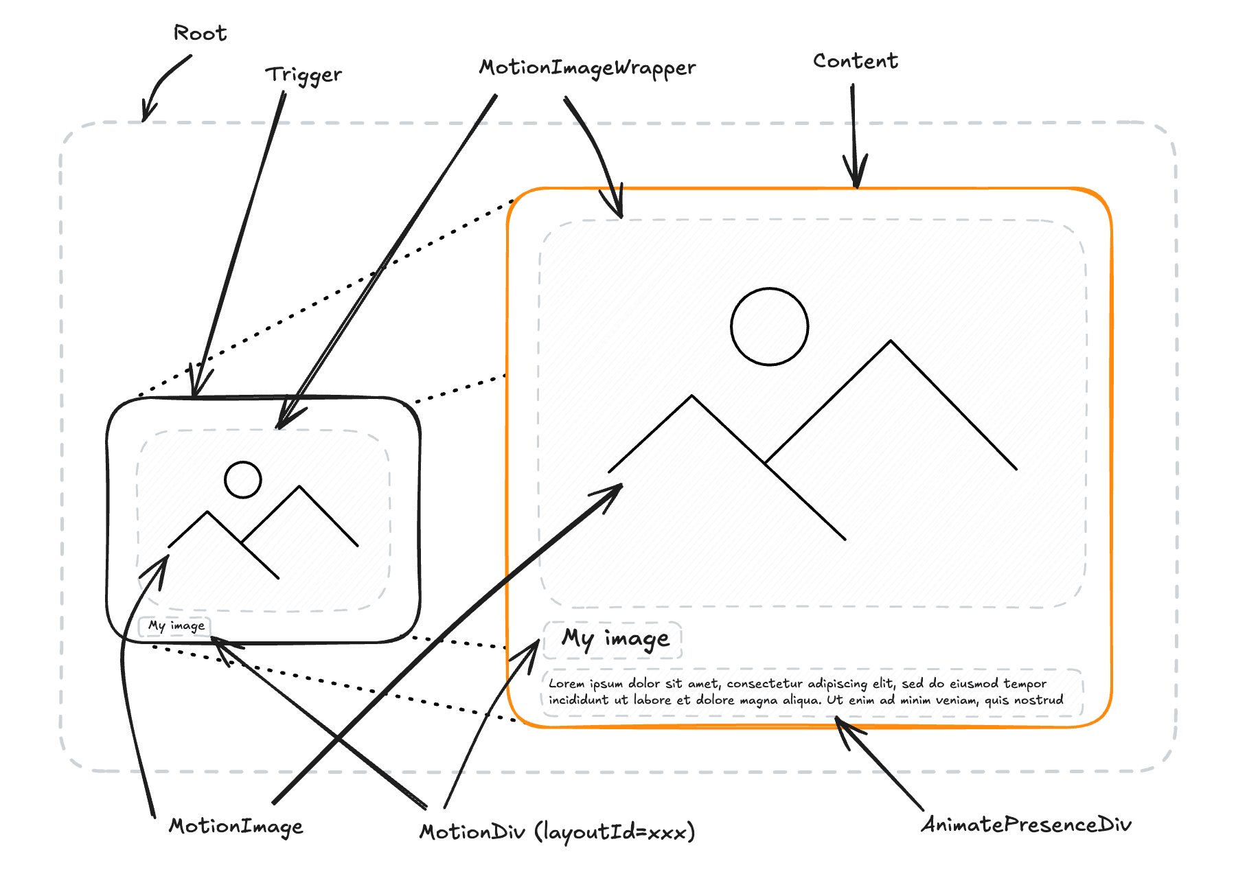

Creatorem Dialog component anatomy
How it works
Here is a short explanation of how layout animations are handled in motion.
Let's call :
- origin : the original element
- target : the target element having the style that we would like to transition to.
To give the illusion that the element is always present in the viewport, motion looks at the future and present (position, size) of the origin and target before the animation is applied.
Knowing that, motion will do several operations at the same time:
- on the origin :
- apply animated
translateandscaletransformations to fit the future (position, size) - use a fade-out to smoothly make it disappear
- apply animated
- on the target :
- apply animated
translateandscaletransformations to fit the origin (position, size) - use a fade-in to smoothly make it appear
- apply animated
As the fade-out of the origin and the fade-in of the target are place on top of each other (by making sure that they share the same (position, size)), it gives the illusion that the element is always present in the viewport.
Finally, motion use the layoutId to know which origin and target are related to each other.
A target is a motion component wrapped in an <AnimatePresence> component.
Better you will understand how motion layout works, the better you will be able to use this component.
Here is a schema that tries to illustrate what we said above:
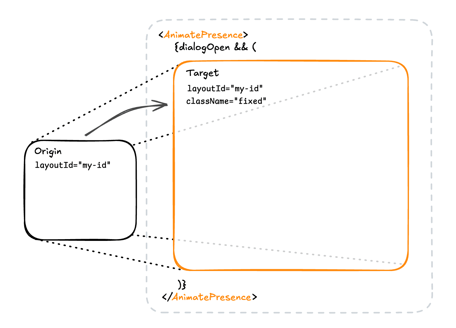

Dialog motion layout schema
Layout vs non-layout components
In this page, what we call a layout component is a component that will be present in the origin and the target and that will be animated during the transitions to the new position.
Non-layout components are :
- components that will be present in the target only
- non-motion components
- motion components without a
layoutIdprop
The dialog component is based on the layoutId props. For that reason, a layout component is not just a motion component with the layout attribute, the layoutId is required.
| Layout component | Non-layout component |
|---|---|
DialogTrigger, DialogContent, MotionImageWrapper, MotionImage,DialogMotionDiv (with a layoutId prop) | DialogAnimatePresenceDiv, DialogOverlay, DialogPortal, DialogClose, DialogMotionDiv (without layoutId) |
Examples
Variant 1
Variant 2
Tailwind animation
The components are built to animate components with css and tailwindcss.
Each one of our components has a data-open attribute that you can use to animate your content with tailwind.
To have a better understanding of how it works, here is a timeline of the animation:
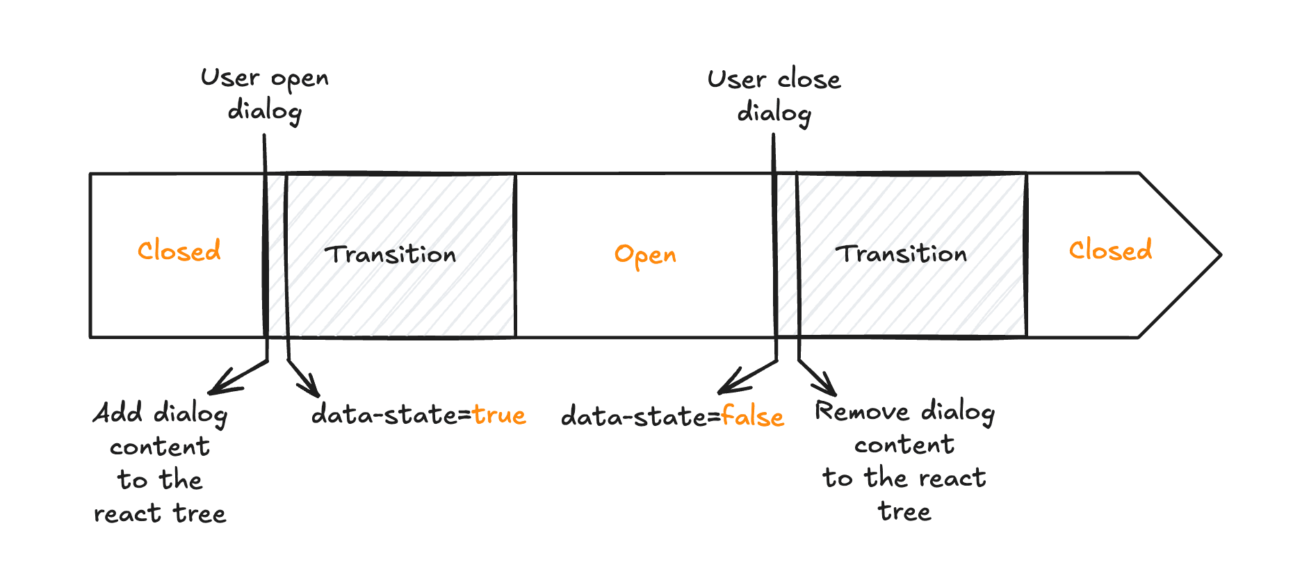

Dialog timeline
When opening
We change the data-open to true after adding the DialogContent to the react tree to be able to trigger transitions with the data-open attribute.
When closing
For the same reason, we change the data-open to false before removing the DialogContent from the react tree to be able to trigger transitions with the data-open attribute before the content is removed.
CSS variables
We are exposing css variables to access the animation duration that you passed to the component.
| Variable | Value |
|---|---|
--dialog-duration | The duration of the animation |
--dialog-duration-95 | 95% of the animation duration |
--dialog-duration-90 | 90% |
--dialog-duration-80 | 80% |
--dialog-duration-70 | 70% |
--dialog-duration-60 | 60% |
--dialog-duration-50 | 50% |
--dialog-duration-40 | 40% |
--dialog-duration-30 | 30% |
--dialog-duration-20 | 20% |
--dialog-duration-10 | 10% |
Classname usage
You can use the data-open attribute to animate your content with tailwind.
The following examples are equivalent:
<DialogAnimatePresenceDiv
onceOpen
durationFactor={0.4}
delayFactor={0.8}
initial={{ opacity: 0 }}
animate={{ opacity: 1 }}
exit={{ opacity: 0 }}
transition={{ type: 'tween', ease: 'linear' }}
className="absolute inset-0 z-10 h-[520px]"
>
{children}
</DialogAnimatePresenceDiv><DialogMotionDiv
className={cn(
'absolute inset-0 z-10 h-[520px]',
'duration-[var(--dialog-duration-40)]',
'data-[open=true]:opacity-100',
'data-[open=false]:opacity-0'
)}
>
{children}
</DialogMotionDiv>If you want to animate other component, use the parent group.
- the
dialog-triggergroup for trigger children - the
dialoggroup for content children
<div
className={cn(
'absolute inset-0 z-10 h-[520px]',
'duration-[var(--dialog-duration-40)]',
'group-data-[open=true]/dialog:opacity-100',
'group-data-[open=false]/dialog:opacity-0'
)}
>
{children}
</div>Troubleshooting
Why do we use an ImageWrapper ?
motion uses the scaleX and scaleY transform properties to change the size of the element.
This may lead to deformation of the element, making it hard to properly render images.
Wrapping the image with position absolute in a relative container avoid this issue.
This requires several things:
- the image must be bigger than the wrapper
- set yourself the x and y position of the image to make it covers the entire
relativewrapper
API Reference
Root
DialogProps
| Prop | Type | Default |
|---|---|---|
transition | (ValueAnimationTransition<any>... | |
defaultOpen | boolean | false |
open | boolean | |
onOpenChange | function |
Trigger
The Trigger has the same layoutId than the Content component.
Props: Omit<HTMLMotionProps<'div'>, 'layoutId' | 'transition'> & React.PropsWithChildren
Content
The Content has the same layoutId than the Trigger component.
| Prop | Type | Default |
|---|---|---|
clickBehaviour | "none" | "close" | 'close' |
wrapper | React.HTMLAttributes<HTMLDivElement> |
MotionImageWrapper
| Prop | Type | Default |
|---|---|---|
layoutId* | string |
MotionImage
| Prop | Type | Default |
|---|---|---|
layoutId* | string |
MotionDiv
Wrapping a text with this component avoid deformation.
Props: HTMLMotionProps<'div'>
AnimatePresenceDiv
Used to animate new content (not present in the origin) in the dialog content.
We are using a local <AnimatePresence> and open state effect to trigger motion initial, animate and exit animation states.
DialogAnimatePresenceDivProps
| Prop | Type | Default |
|---|---|---|
onceOpen | boolean | |
delayFactor | number | 1 |
durationFactor | number | 0.5 |
Overlay
Props: Omit<HTMLMotionProps<'div'>, 'layoutId'>
Portal
The radix portal component.
Close
Props: HTMLMotionProps<'button'>
A guided tour that helps users understand the interface.
Apply glowing effects to SVG elements with cursor tracking.
How is this guide?
Last updated on 1/29/2026